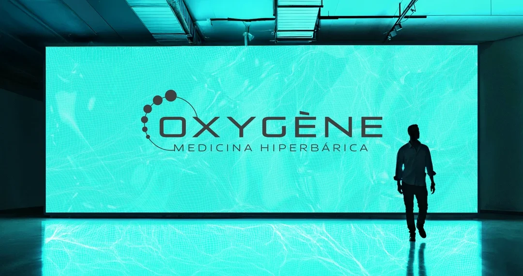
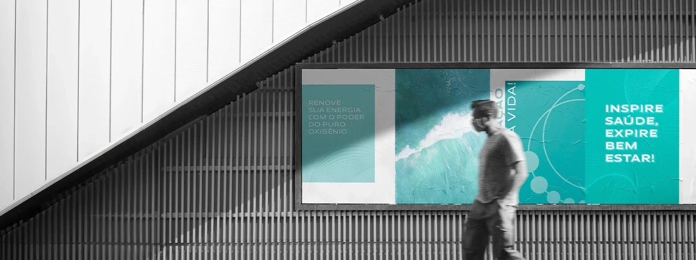
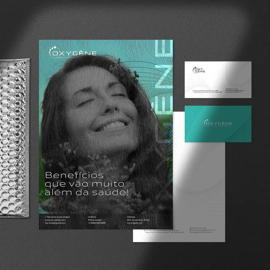
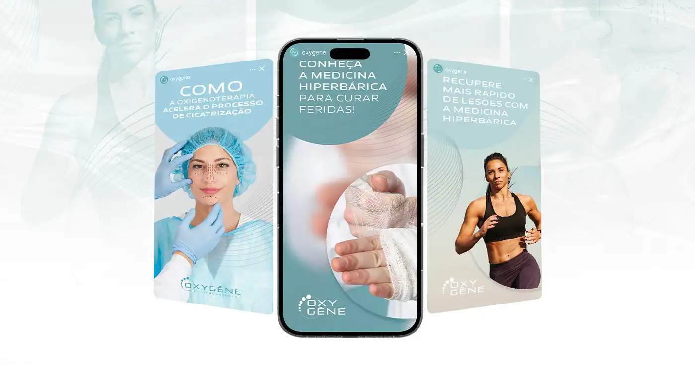
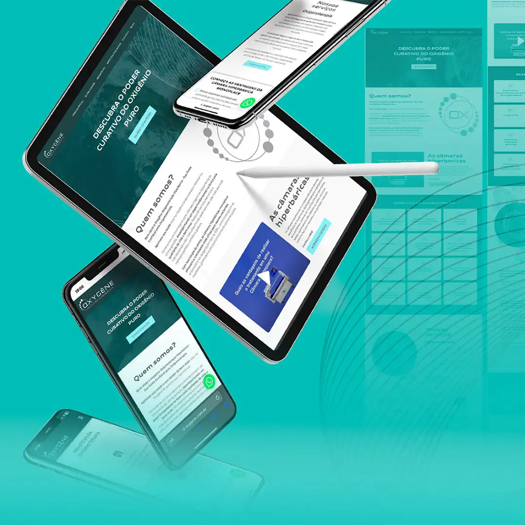
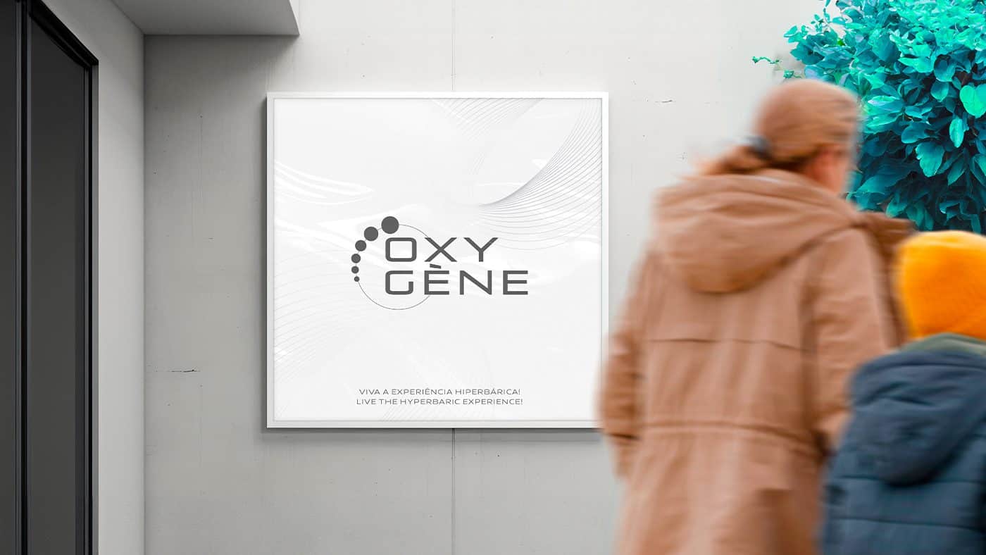
Identity and digital presence to translate medical technology, trust and human care into a clear, contemporary brand experience.
HEALTH · HYPERBARIC MEDICINE · VISUAL IDENTITY · WEBSITE
Studio Belga · DEX® Method
Scroll to explore the project ↓
THE BRAND STORY
Technology and care needed to speak the same language.
Oxygène works in the world of hyperbaric medicine, a field where innovation, safety and trust must be present throughout the patient experience.
The brand needed to explain a technical service in a more understandable way, without losing the precision a medical clinic requires. At the same time, its visual presence had to convey warmth and modernity.
Studio Belga developed the visual identity and the website to organize this proposition into a coherent system — one that brings medical information, technology and human care closer together.
THE CHALLENGE
Making the complex clearer, closer and more trustworthy.
Hyperbaric medicine is still little known by much of the public. That's why the brand had to build confidence quickly and create an accessible, informative journey for patients and medical partners.
The challenge was to avoid both a cold, hospital-like language and a generic wellness aesthetic, creating a proprietary and technically responsible presence.
01
Communicate trust
Create a presence that matches health decisions and clinical responsibility.
02
Explain clearly
Organize services and technical content into an understandable digital journey.
03
Humanize technology
Balance innovation, precision and closeness at every touchpoint.
THE STRATEGY
Oxygen as a symbol of renewal, movement and life.
The brand direction was built on the combination of science and human experience. The visual system uses movement, transparency and a technological atmosphere to convey recovery and vitality.
In the digital environment, the strategy prioritizes hierarchy, readability and guidance. Users better understand the clinic's world and find clear paths to learn about services, the team and ways to get in touch.
Precision
A clean, controlled visual language to convey medical responsibility.
Innovation
Colors, textures and movement connect the brand to the world of health technology.
Warmth
Information is organized to lower barriers and bring patients closer.
VISUAL IDENTITY
A visual atmosphere inspired by oxygen, flow and regeneration.
The palette combines deep and luminous aqua-green tones to build a technological perception without losing lightness. The contrast with black and white reinforces clarity and sophistication.
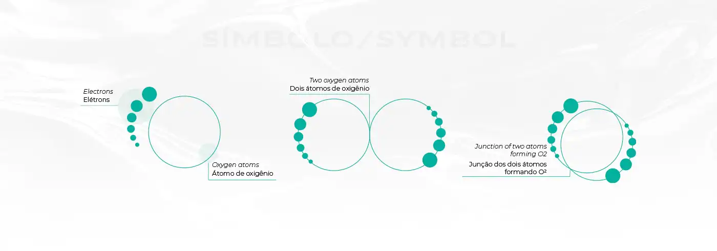
The circular symbol and repeating elements suggest flow, particles and movement. Applied consistently, these codes connect institutional materials, medical communication and the digital experience.
Aqua green
Vitality, renewal and technology in a recognizable, contemporary color.
Circular system
Movement and particles as a visual reference to oxygen and regeneration.
Technical contrast
Black, white and luminous surfaces balance precision and warmth.
PETROL
WHITE
AQUA
DIGITAL EXPERIENCE
A website that turns technical information into guidance.
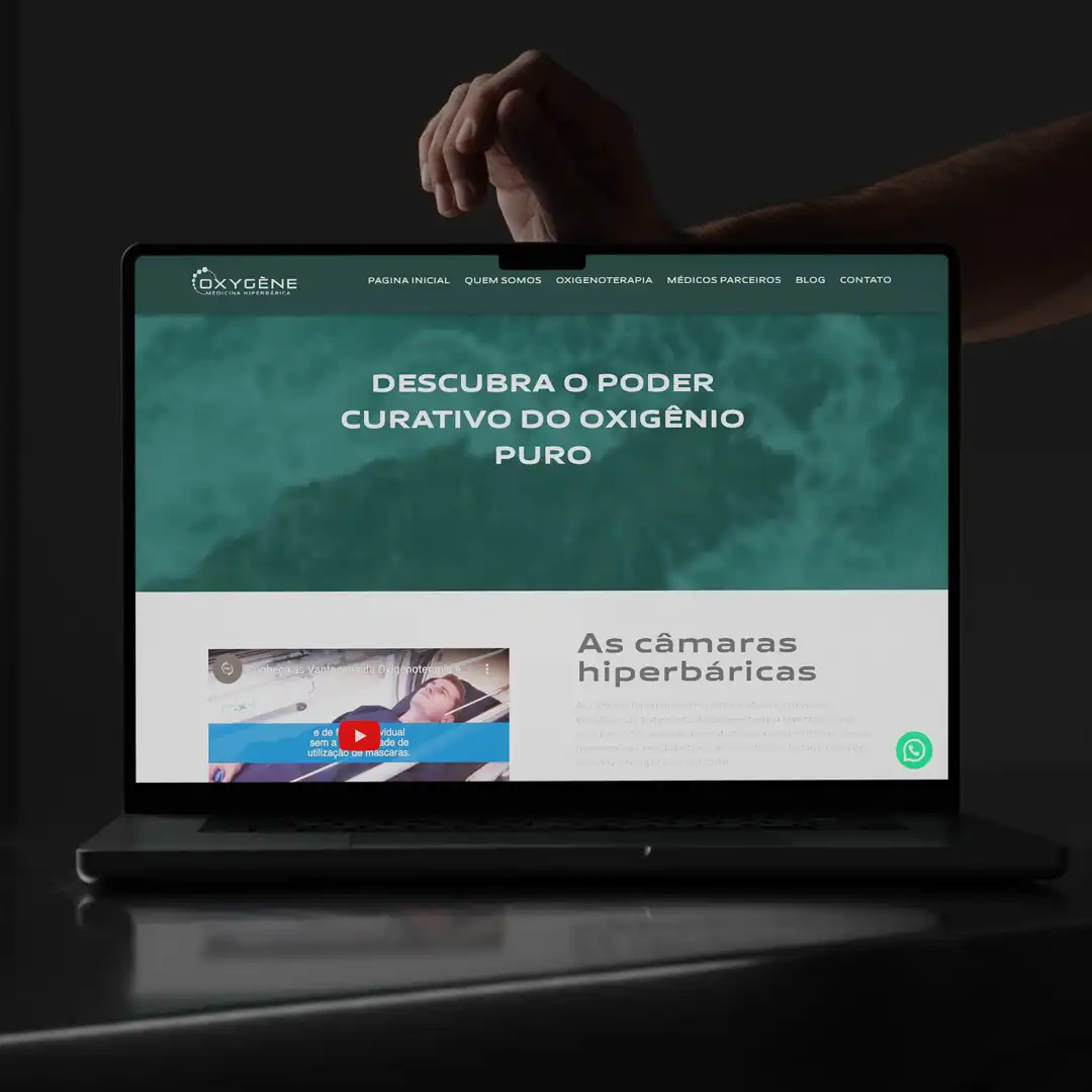
The website architecture organizes content about the clinic, its services and hyperbaric medicine with a clear hierarchy. Navigation reduces effort and leads users to the most relevant information.
The identity comes to life in the digital environment through imagery, transparency, contrast and controlled movement — creating an experience consistent with the promise of innovation and care.
01
Strategy and visual direction
02
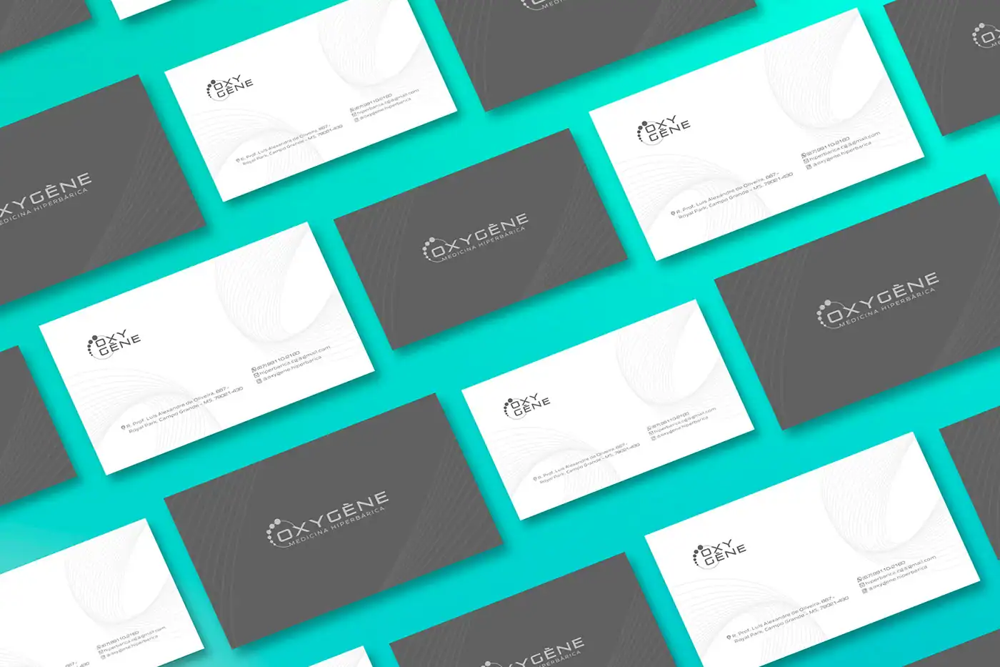
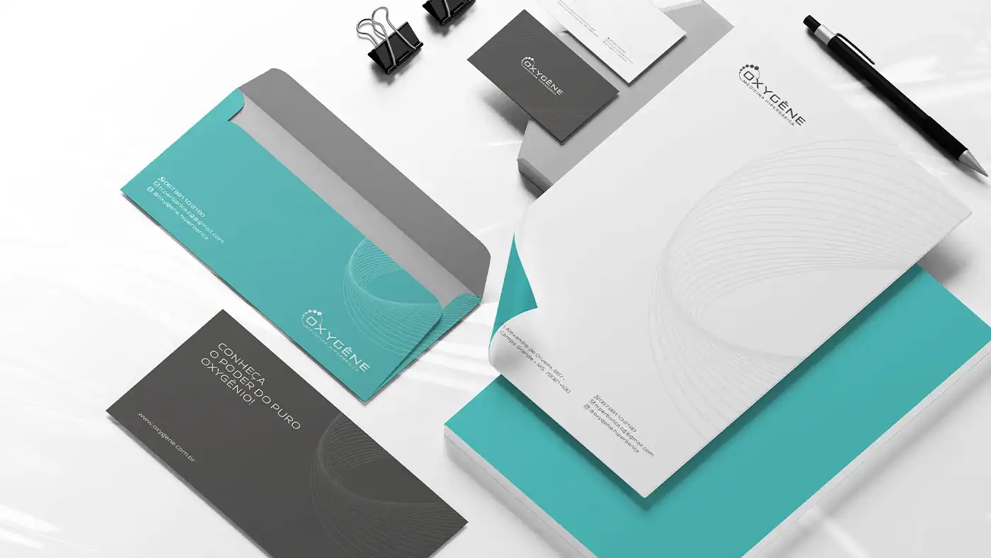
Complete visual identity
03
Graphic system and applications
04
Corporate website
05
Digital experience organization
THE RESULT
A clearer, more technological and more human medical brand.
The new presence connects identity and website into a single experience. Oxygène now communicates a specialized service with more clarity, consistency and trust.
More accessible information
The digital journey helps the public better understand the clinic and its services.
Visual trust
The system balances technology, medical responsibility and warmth.
Consistent presence
Identity and website now express the same value proposition.
“
Our experience with Belga was sensational. They delivered the Oxygène visual identity and website project beyond what we imagined. It exceeded our expectations.
OXYGÈNE · MEDICAL CLINIC
THE NEXT PHASE OF YOUR BRAND
Your story can also become a brand that's impossible to ignore.
Strategy, identity and experience working together to turn perception into value.