Rebranding and packaging design to turn the tradition of Italian artisanal pasta into a premium, authentic and memorable brand experience.
GASTRONOMY · VISUAL IDENTITY · PACKAGING · 2025
Studio Belga · DEX® Method
Scroll to explore the project ↓
THE BRAND STORY
An artisanal tradition ready to claim an even more distinctive space.
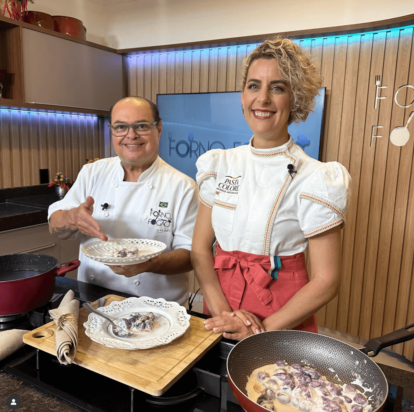
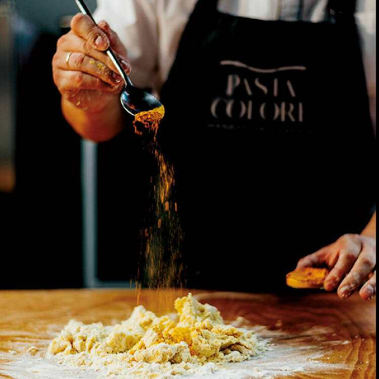
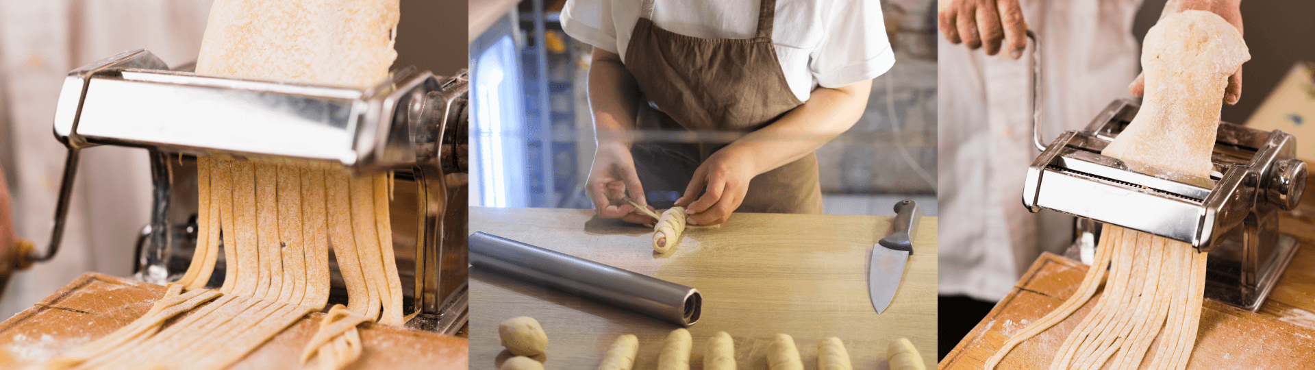
Pasta Colore was born in 2012 with the purpose of reviving the tradition of Italian artisanal pasta, made with care, selected ingredients and respect for its origins. Conceived by Camila, the brand grew from the desire to bring people the true taste of Italy — with color, texture and affection in every preparation.
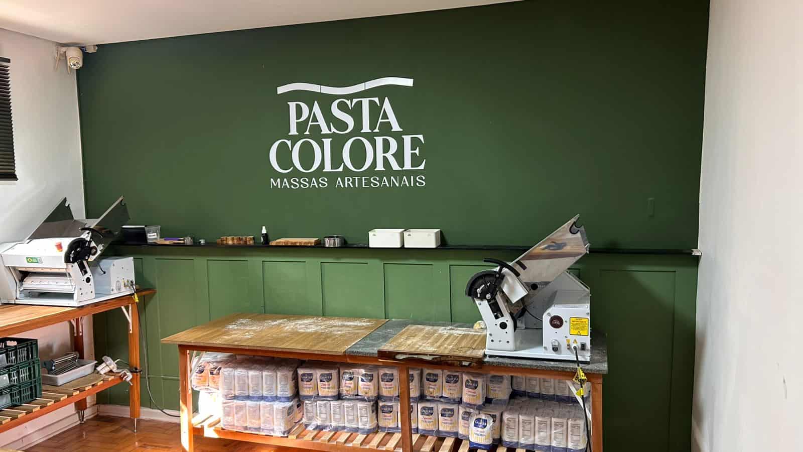
After a pause in 2015, the brand resumed operations in 2020. Production returned in Camila's own apartment, and high demand quickly called for a new space to fulfill orders.
By preserving its artisanal essence and entering a new phase of growth, Pasta Colore needed an identity capable of conveying its journey, its authenticity and its passion for good food.
THE CHALLENGE
Evolving perception without erasing history.
The artisanal food market has increasingly come to value the origin, quality and authenticity of food. Pasta Colore already delivered all of this in its product; the project needed to make these differentiators equally clear in the brand.
The challenge was to reposition the company as an experience that goes beyond food — communicating tradition, culture and emotional memory, while raising perceived value and preparing the brand for new markets.
01
Preserve the origin
Keep the Italian roots, the handmade care and the story built since 2012 visible.
02
Raise perceived value
Create a more sophisticated presence without losing the closeness and affection of artisanal production.
03
Organize the portfolio
Build a functional visual system for different pastas, packaging and touchpoints.
THE STRATEGY
From handmade pasta to a brand experience.
The positioning was built from what Pasta Colore already had that was most valuable: a true story, a signature product and an emotional relationship with Italian cooking.
Instead of turning the brand into a generic representation of Italy, the project organized its own codes to communicate artisanal excellence, warmth and desire — from the packaging to the experience at the table.
Tradition
The Italian origin appears as memory, culture and respect for the artisanal process.
Authenticity
The brand takes on the personality of fresh, colorful pasta made with care.
Desire
Every visual choice brings the product closer to a premium, memorable culinary experience.
VISUAL IDENTITY
An elegant, welcoming visual system full of personality.
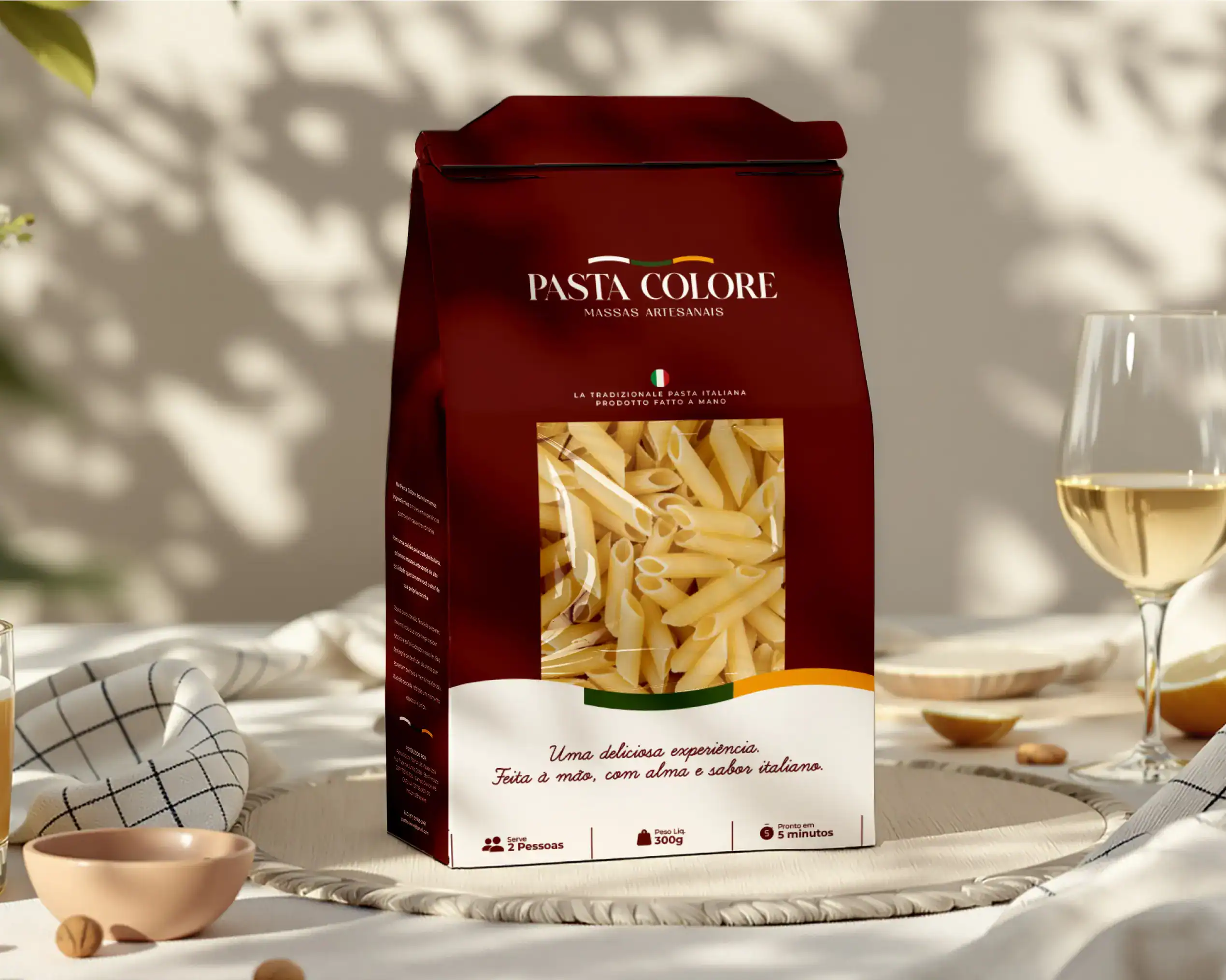
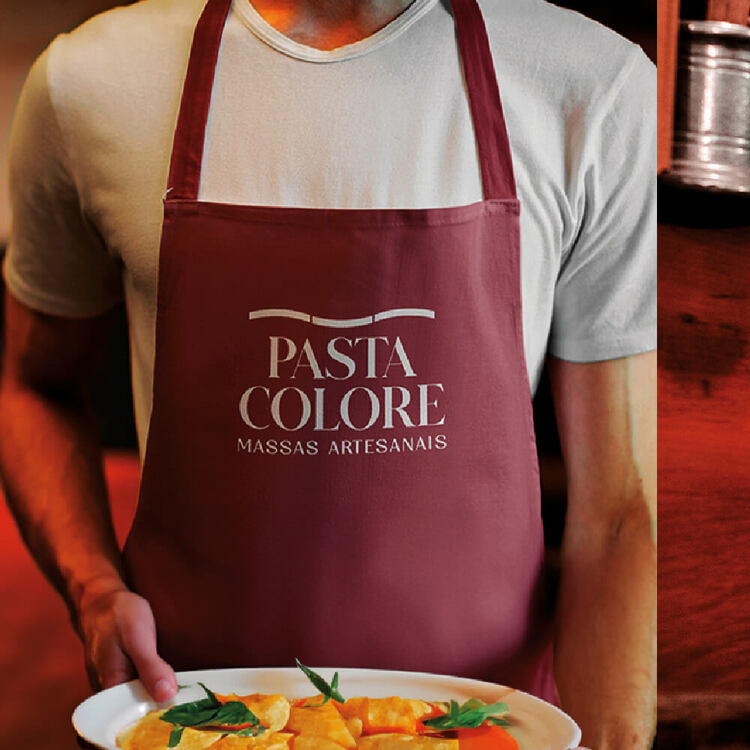
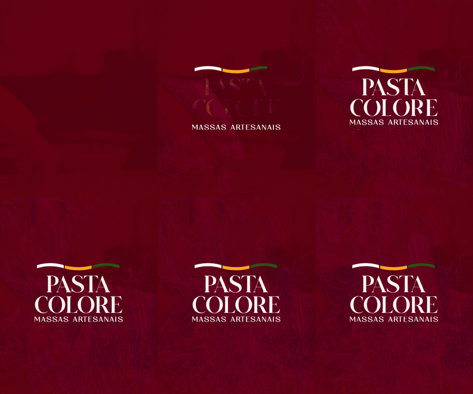
The deep wine color creates an atmosphere of warmth, sophistication and emotional connection, bringing the brand closer to Italian culinary tradition and the nobility of the artisanal.
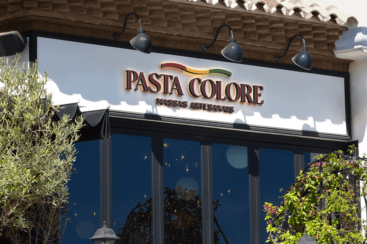
The logo uses a refined typeface with an elegant serif. Above it, the curved gesture in red, yellow and green represents the movement of fresh pasta and natural ingredients, subtly reinterpreting the colors of Italy.
Deep wine
Warmth, sophistication and intensity to support a premium perception.
Refined serif
A visual voice with tradition, personality and presence on the packaging.
Tricolor gesture
Movement, natural ingredients and an Italian reference without resorting to the obvious.
PACKAGING DESIGN
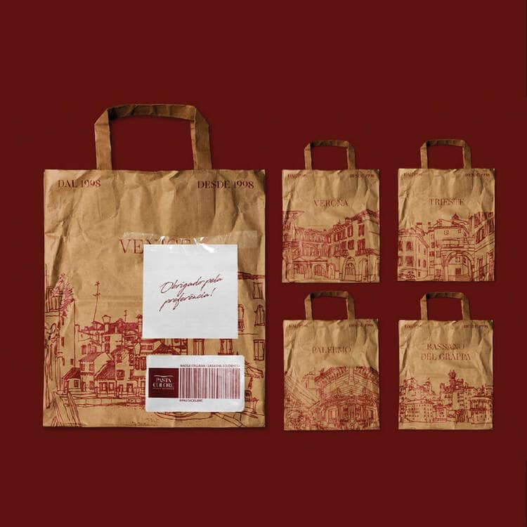
Packaging turns the product into the first contact with the brand.
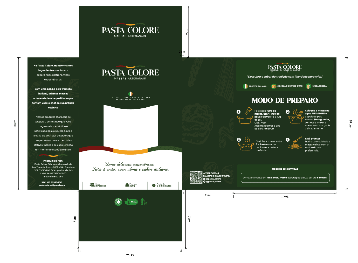
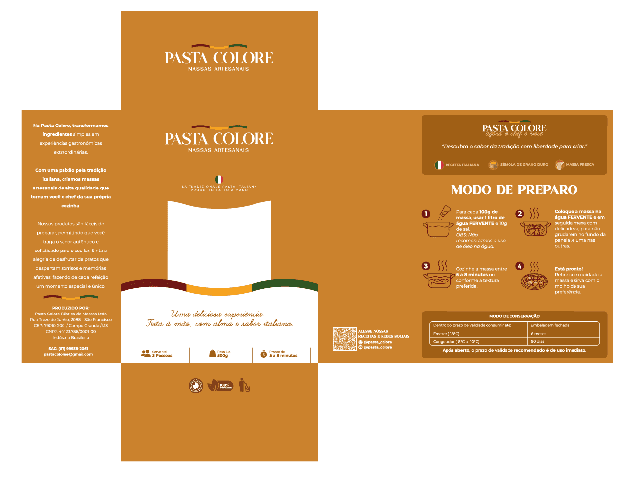
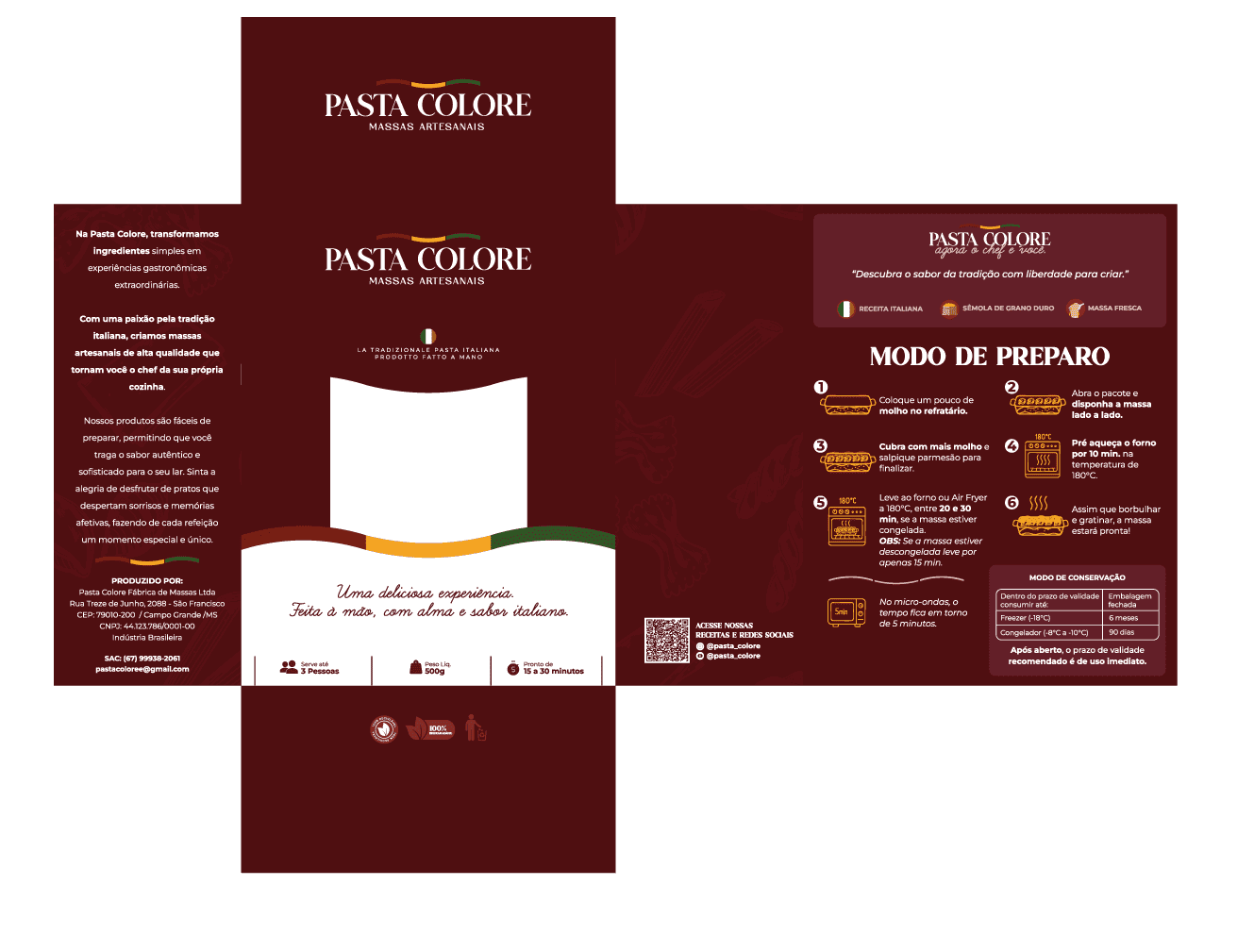
The packaging was rethought as a clean, functional visual system. The transparent window gives the pasta center stage and reinforces the product's authenticity, while the light base and tricolor finish organize the information.
The tagline “A delicious experience. Handmade, with soul and Italian flavor” brings the brand closer to the consumer and conveys what lies behind every product: technique, origin and affection.
01
Strategy and positioning
02
Complete visual identity
03
Graphic system and brandbook
04
Packaging line
05
Creative direction and applications
THE RESULT
A premium, accessible and memorable brand — without losing its roots.
The rebranding organizes Pasta Colore's story into a coherent, recognizable presence ready to grow. The new identity highlights the product and creates consistency across brand, packaging and experience.
Clear positioning
The artisanal tradition now occupies a distinct, understandable visual territory.
Perceived value
Colors, typography and finish bring the product closer to a premium culinary experience.
Portfolio consistency
The system organizes different pastas and applications without losing brand recognition.
“
The team captured the essence of my brand in a way I never imagined. The new identity perfectly reflects the aesthetic of Pasta Colore and has been essential in attracting new customers.
PASTA COLORE · FOOD INDUSTRY
THE NEXT PHASE OF YOUR BRAND
Your story can also become a brand that's impossible to ignore.
Strategy, identity and experience working together to turn perception into value.