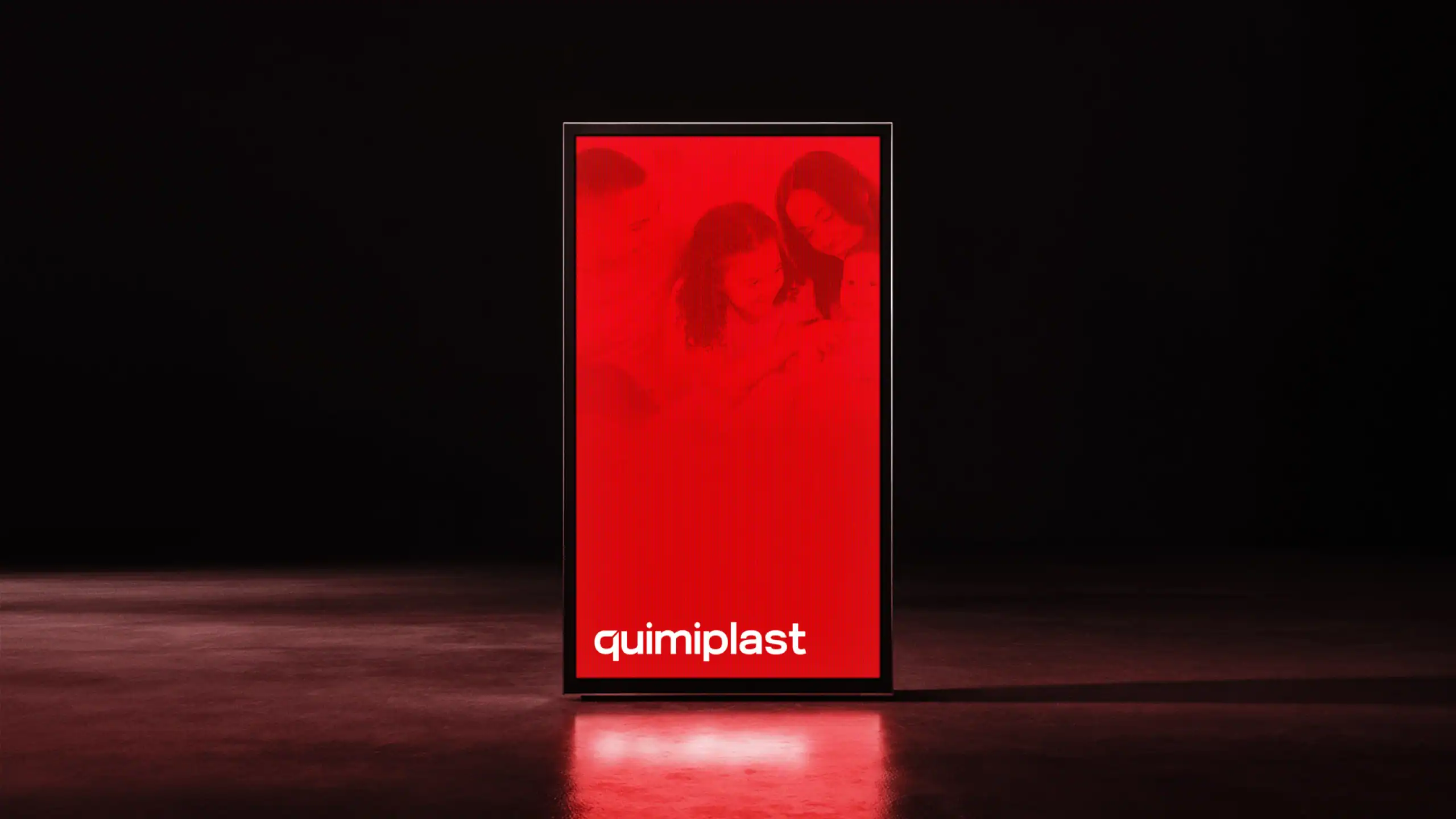
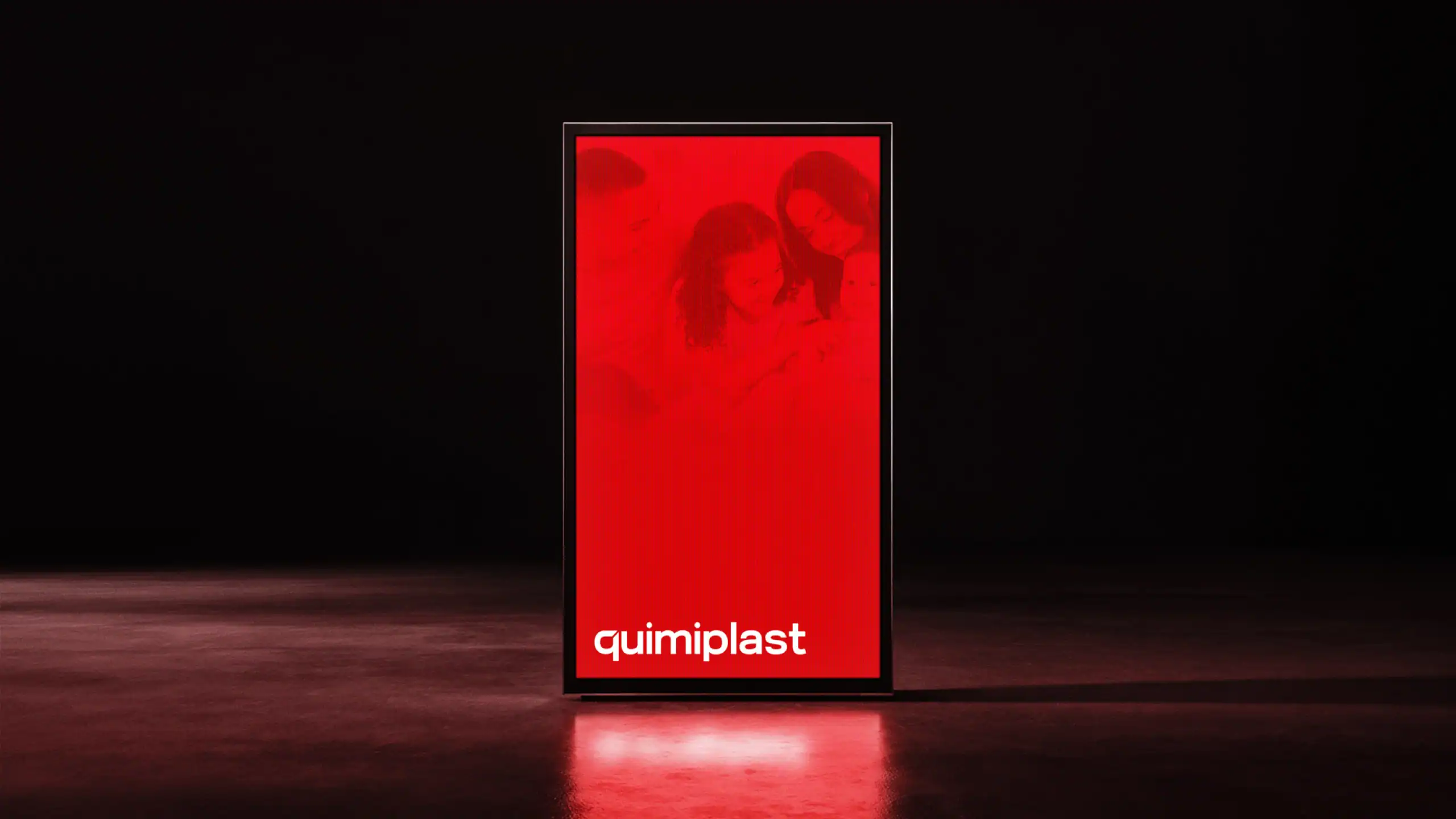
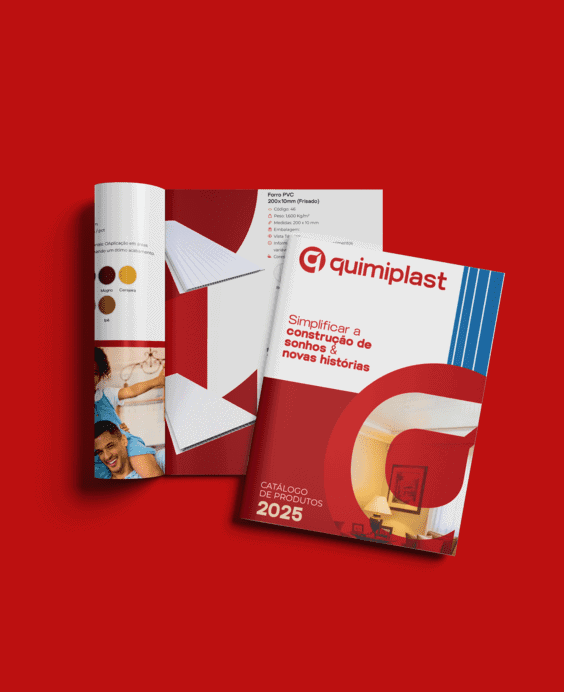
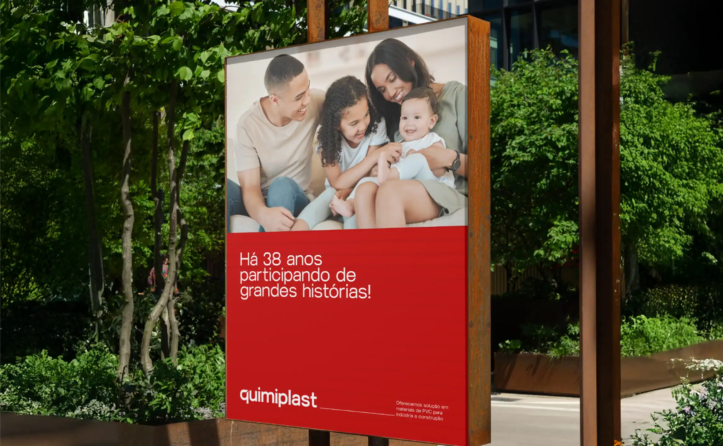
Repositioning, identity and digital experience for an industry with decades of history to take on a more modern, clear and trustworthy presence.
CONSTRUCTION · VISUAL IDENTITY · WEBSITE · PACKAGING · 2024
Studio Belga · DEX® Method
Scroll to explore the project ↓
THE BRAND STORY
A solid company needed a brand worthy of its evolution.
Quimiplast was founded in 1987 in Dourados, MS. Its first product was Assentarite, a mortar additive still manufactured today and developed to improve uniformity and help prevent cracks and fissures.
Faced with difficulties in sourcing its own packaging, the company expanded into the plastics sector. Since then, it has broadened its lines and segments without abandoning its essence: developing solutions for construction with versatility, safety and quality.
With a larger portfolio and new touchpoints, the brand needed to reflect the strength it had earned while also making its communication simpler for customers, distributors and construction professionals.
THE CHALLENGE
Modernizing an established brand without losing its authority.
The construction sector demands performance, trust and technical clarity. Although Quimiplast already had experience and well-known products, its identity needed to better organize that perception and communicate its new moment.
The project integrated brand, packaging, catalog and website to create a single experience — reducing noise, improving portfolio navigation and preparing the company to speak to a broader audience.
01
Preserve recognition
Evolve the existing codes without breaking from the history built since 1987.
02
Organize the offering
Make it easier to identify products, categories and technical information.
03
Unify the experience
Connect identity, packaging, catalog and website in a single system.
THE STRATEGY
Industrial strength with more human, functional communication.
The repositioning reinforced Quimiplast as a strategic partner of the construction industry: a company that combines experience, technology and practicality to contribute to more efficient projects.
The visual strategy was built to work on the job site, at the point of sale and in the digital environment. Every piece had to inform quickly, build trust and strengthen brand recognition.
Trust
A robust presence that conveys experience, safety and commitment to results.
Clarity
Information hierarchy and categorization to make choices easier and reduce doubts.
Innovation
A contemporary language ready for new products, channels and audiences.
VISUAL IDENTITY
A robust, modular and recognizable system.
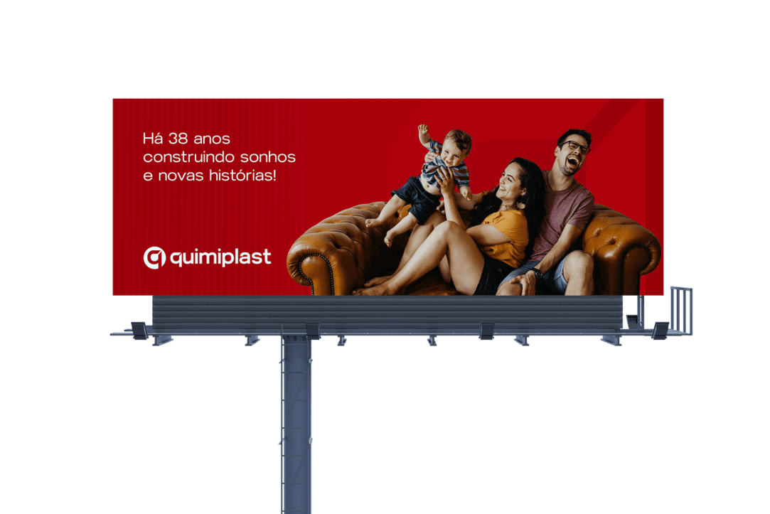
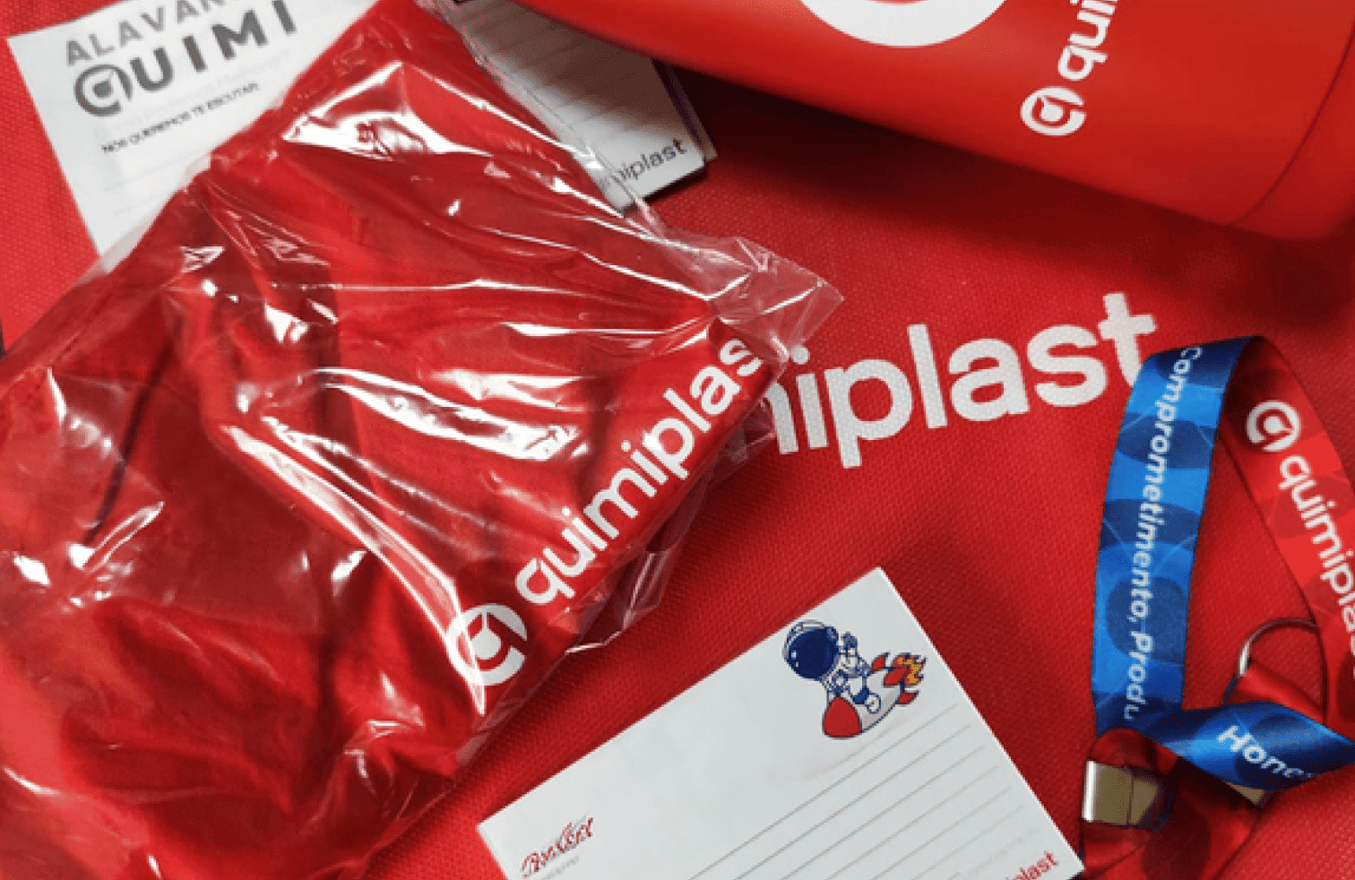
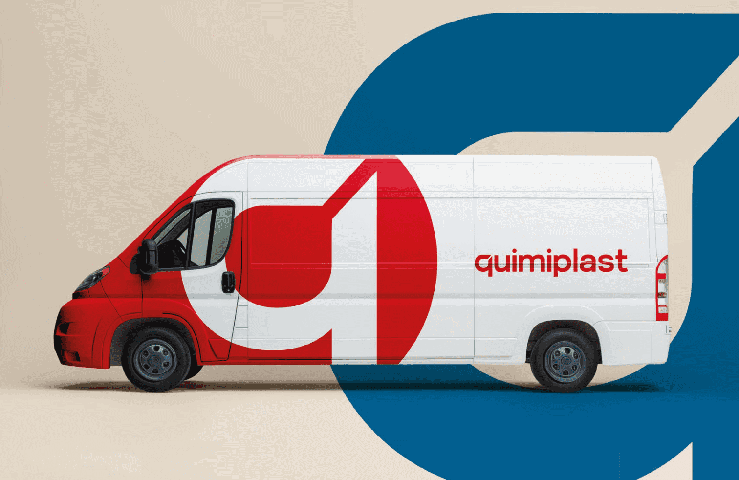
Red was preserved as the core color for its strength and recognition, while neutral tones add a sense of technology and professionalism. The contrast lets the brand keep its presence in complex environments and technical applications.
The logo was refined with a more secure, legible geometric construction. The visual system organizes product families, institutional content and sales materials without fragmenting the identity.
Proprietary red
Strength, recognition and visibility across different touchpoints.
Geometric typography
Quick reading and a contemporary, technical and trustworthy presence.
Modular system
A replicable structure for product lines, packaging and digital communication.
WEBSITE AND PACKAGING
The identity gained function at every touchpoint.
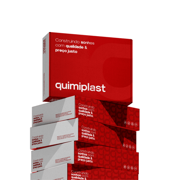
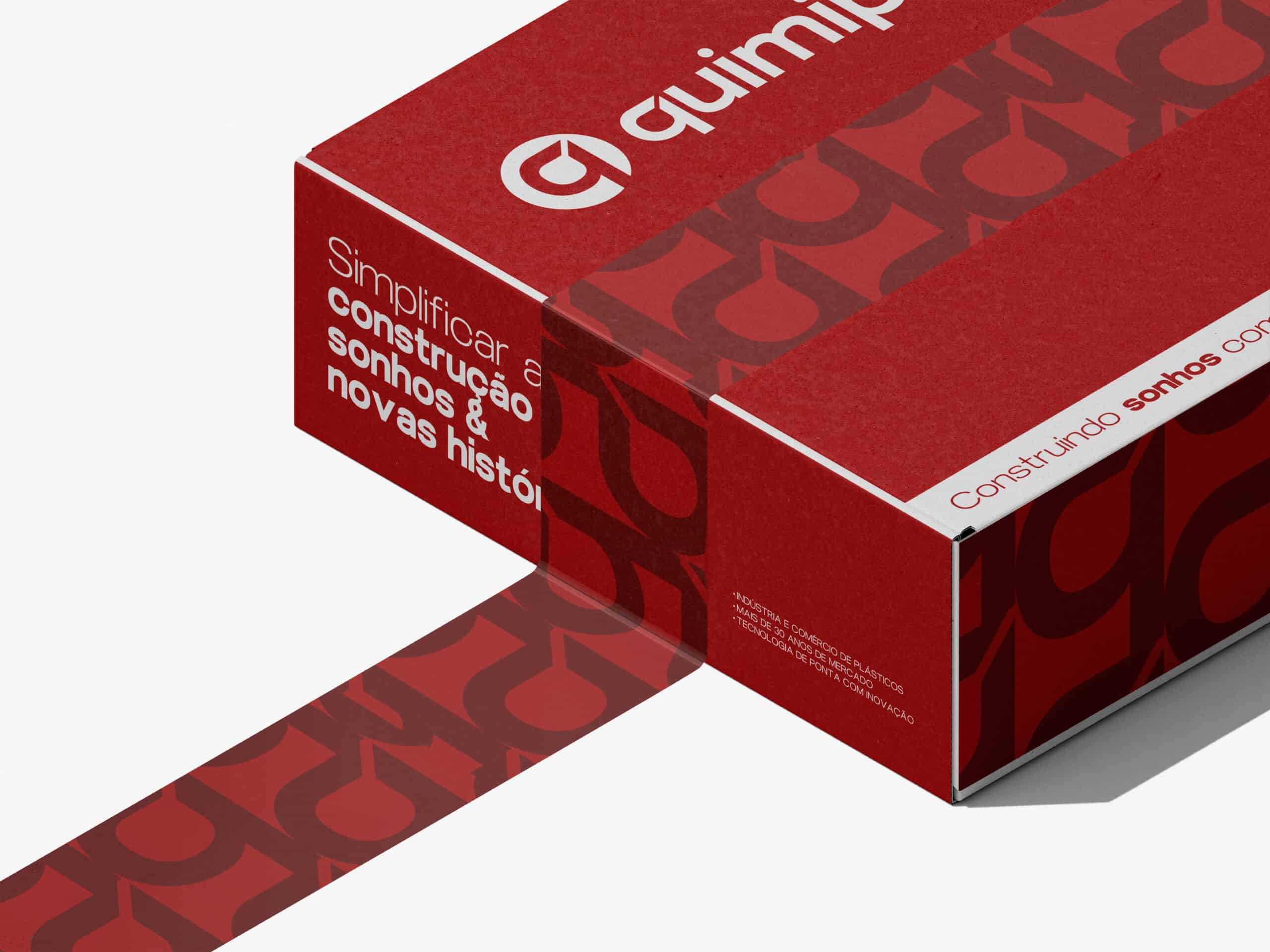
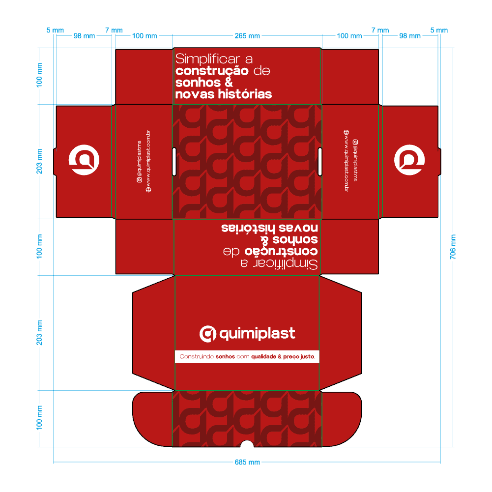
The packaging received a clear hierarchy, color-coded categorization and modular organization to make everyday identification easier and showcase the portfolio at the point of sale.
For the website and catalog, the project prioritized usability, readability of technical information and navigation. The result is a more objective experience for anyone who needs to learn about products, applications and differentiators.
01
Strategy and repositioning
02
Visual identity and brandbook
03
Packaging system
04
Corporate website
05
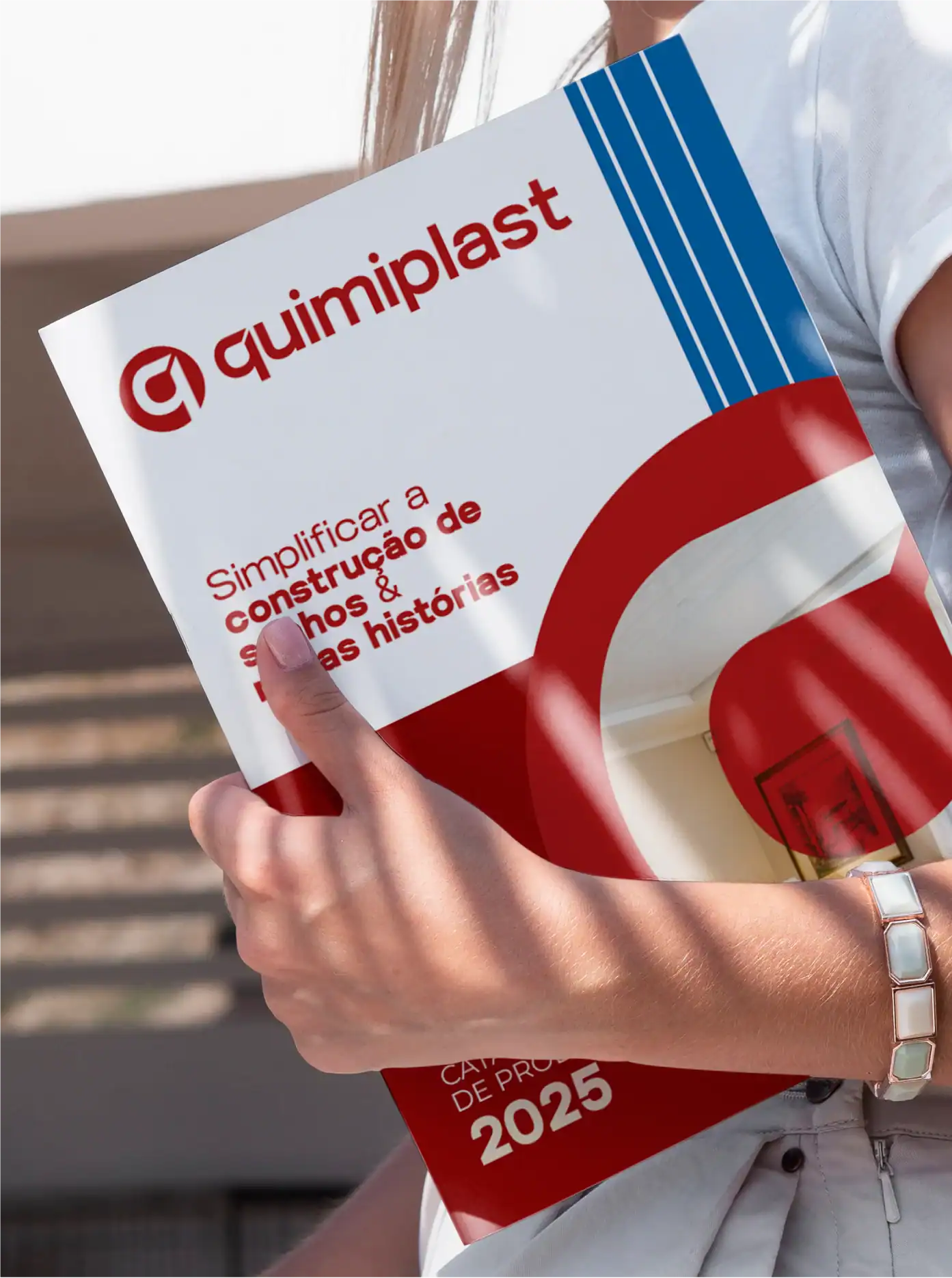
Product catalog
THE RESULT
A stronger, clearer presence, ready to grow.
The rebranding establishes Quimiplast as a modern, trustworthy industrial brand. The integration of identity, packaging and digital turns technical expertise into accessible, consistent communication.
A more understandable portfolio
Products and categories are now identified faster and with more confidence.
A more consistent brand
The same positioning appears in the product, at the point of sale and in the digital experience.
Renewed authority
The company's history gains a contemporary expression without losing recognition.
“
Studio Belga was extremely helpful in every way, from the rebranding of our brand to building the website, catalog and packaging. We appreciate the patience and care they put into our project.
QUIMIPLAST · PVC INDUSTRY
THE NEXT PHASE OF YOUR BRAND
Your story can also become a brand that's impossible to ignore.
Strategy, identity and experience working together to turn perception into value.